
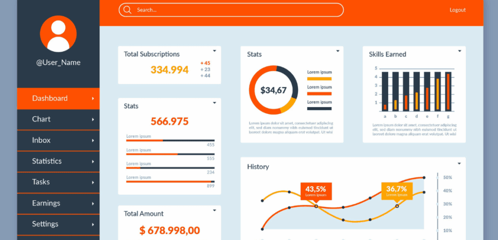
Modern automotive service operations are completely reliant on speed and clarity. Service advisors take up the position of communicating with the customers, coordinating the technicians, as well as being the ones who generate the revenue. They face the challenge of making a large number of decisions every day are often under pressure. While being at the same time satisfying customers’ needs and the shop’s capabilities. It is in that situation that the design and the configuration of a service advisor dashboard may either boost performance or silently slow things down.
Dashboards are not seen as mere reporting devices anymore. They have become real-time decision-making machines. If a service advisor’s dashboard is designed properly, it will show the user what to prioritize, inform them about the risks, and guide his/her actions without causing any confusion or stress for the user. If the design is poor, it will just be another screen for the advisors that they will treat as such—one that they will ignore.
This post discusses the factors that are crucial in designing dashboards that can support decision-making that is not only faster but also of better quality, such as focusing on relevance, hierarchy, and usability. It will also look at the interrelationship of service advisor performance dashboards, auto service dashboard metrics, and modern automotive service reporting tools in terms of the improvement of efficiency, revenue, and customer satisfaction.
Why the Service Advisor Dashboard Structure Directly Affects Decision Speed
A service advisor dashboard should not be considered as a mere numbers game. Rather, it is a visual workflow that affects the advisor’s thought process, reactions, and task prioritization. The dashboard’s design dictates the manner in which important information is viewed—whether it is at once displayed or the other way round, i.e., hidden under less important data.
Service advisors are working in real-time. They require immediate access to appointment status, vehicle progress, approvals, and customer wait times. A proper service advisor dashboard, built correctly first, alleviates the mental burden on the advisor by showing only what is crucial at that very moment when a decision is required.
On the contrary, badly designed dashboards hinder decision-making by making the advisors spend time searching for information, deciphering unclear metrics, or even worse, switching between systems. This goes on and causes delays, loss of upsell opportunities, and customer dissatisfaction. Good dashboard design serves the purpose of achieving speed by means of clarity, not through an increase in the amount of data.
Core Objectives of a Service Advisor Dashboard
It is essential to grasp the purpose of a service advisor dashboard before making up your mind about what to showcase. The main not reporting for management support but operational decision-making for the front-line personnel is the primary aim.
A well-structured service advisor dashboard should facilitate the advisors to quickly respond to the critical queries: Which vehicles require immediate attention? Whose customers are on the waiting list? Where are the approvals stuck? Which tasks are likely to be delayed?
In this respect, service advisor performance dashboard concepts are quite different from general automotive service reporting tools. Performance dashboards highlight actionable insights, not historical summaries. Auto service dashboard metrics should influence behavior in the moment, not just explain what happened yesterday.
When the decision-making processes are supported by real advisor workflows, the speed of the decision naturally increases.
Key Auto Service Dashboard Metrics Every Service Advisor Dashboard Should Prioritize
Not every metric is worthy of the same degree of visibility. The most common error in creating dashboards is putting too many figures at an equal level of significance. A service advisor dashboard should only reveal the metrics that have an immediate impact on the daily decision-making process.
The most crucial metrics on the auto service dashboard usually consist of repair order status, technician progress, customer approval status, and promised completion times. These metrics decide the next step of an advisor—whether to call a customer, check in with a technician, or shift the workload.
Metrics such as average repair order value or upselling rates are less important, yet they are part of the service advisor performance dashboards. However, they shouldn’t take the majority of the operational view. Automotive service reporting tools are most effective when they distinguish between real-time action metrics and performance analysis metrics.
By having a clear prioritization, the advisors will be able to spend their time on actions rather than on interpretation.
Designing a Service Advisor Dashboard Around Workflow, Not Reports
A service advisor dashboard needs to follow the natural flow of a service day. The process is sequential to the advisors: check-in, diagnosis, approval, repair, and delivery. The visual representation of the dashboard should be in accordance with this sequence.
The effective auto service dashboard metrics do not categorize the data but rather group the information according to the task state. Vehicles that need approval should be distinctly set apart from those that are being done or are completed. This will enable the advisors to spot the bottlenecks at once.
Elements of the service advisor performance dashboard, such as conversion rates and response times, can be layered into this workflow view without causing any disruption to it. The automotive service reporting tools should support this method by providing the option of flexible layout and conditional displays.
Decision-making becomes quicker and more instinctive when the dashboards are in line with the way the advisors actually work.
Using Visual Hierarchy in a Service Advisor Dashboard for Faster Decisions
Visual hierarchy ranks the most neglected features of dashboard design among all. In a service advisor dashboard, through size, color, and position, the different levels of urgency and importance should be indicated without the need for any explanation at all.
Critical alerts like delayed jobs or waiting customers should be the first thing to catch the eye. On the contrary, the less urgent information should be placed in the background. This pyramid of information allows the advisors not to waste time scanning the screen for the desired information.
The elements of the service advisor performance dashboard are, to a great extent, reliant on visual cues being consistent. For instance, the color-coded trends make it very easy for the advisors to notice at a glance if the metrics are getting better or worse. The auto service dashboard metrics should visually be consistent across various views to minimize the time spent on learning.
A strong visual hierarchy is what makes dashboards become the decision accelerators instead of the data walls.
Balancing Real-Time and Performance Data in a Service Advisor Dashboard

Dashboard design faces one challenge, and that is balancing between real-time operational data and longer-term performance insights. The service advisor dashboard should put live data in the first place, yet be capable of keeping the performance insight in the background.
Instantaneous data leads to immediate actions like informing customers or interacting with workers. Performance data, on the other hand, is for coaching and improving skills over time. Mixing these elements without any structure confuses.
The best customer service advisor performance dashboards do indeed manage to keep these layers apart. The real-time panels are dedicated to the current workload, whereas the summarizing panels reveal daily or weekly trends. Automotive service reporting tools like those that provide role-based views make this separation clearer.
Clear separation keeps the advisors concentrating on what is important at the moment.
How Automotive Service Reporting Tools Support Scalable Dashboard Design
Tools for modern automotive service reporting are the main driving force behind the effectiveness of dashboards. They are the ones who decide if dashboards can be easily modified or personalized, and how easily they can keep pace with the growth of operations.
When departments are being expanded, dashboards are required to support and cope with changes in volume, i.e., more customers, more service advisors, and more sophisticated workflows. The static type of dashboard does not last long in such a situation, as it is very soon rendered unfit for purpose. The flexible type of reporting tools gives managers the power to modify dashboards for auto service using metrics, without the need for system rebuilding.
The design of the service advisor dashboard, which is scalable, also guarantees uniformity across the different locations. With the use of standardized metrics, performance comparisons are made fair, while through the use of configurable layouts, local customization is allowed.
The selection of proper reporting tools guarantees that the dashboards are kept relevant to the changing business needs.
Service Advisor Dashboard for Coaching and Performance Improvement
A service advisor dashboard, apart from daily work, first and foremost improves performance in the long run. Performance service advisor dashboards show advisors how their activities impact revenue, efficiency, and customer satisfaction, as well as others.
If the performance metrics are shared clearly and constructively, they will promote self-correction instead of defensiveness. The advisors will be able to spot the trends in the approval rates, response times, or follow-ups, and change their behavior accordingly.
The auto service reporting tools that monitor the trends over time make these insights more effective. When auto service dashboard metrics are clear and easy to grasp, they become tools for growth rather than judgment. The appropriately designed dashboards convert the data into development.
Avoiding Common Mistakes in the Service Advisor Dashboard
The majority of service advisor dashboards do not fail due to the absence of data but due to poor design choices. An error that often occurs is the overemphasis on the metrics present on the dashboards. It is a widespread belief that more data will always result in better decision-making.
In addition, the use of metrics that are intended for the management’s eyes only in the advisor-facing dashboards is a mistake that happens quite often. Since these metrics are significant for the management, they still do not always give the advisors the needed information to take further action. The layout of a good service advisor dashboard should closely follow the user’s specific roles.
Different definitions can also destroy trust. If the meaning of auto service dashboard metrics is different in different views, the advisors will stop trusting them. Automotive service reporting tools should maintain metric consistency throughout the organization. Staying away from these traps makes dashboards practical and reliable.
Measuring the Impact of a Well-Structured Service Advisor Dashboard

The service advisor dashboard’s success shall be determined by its outcomes rather than its looks. Design effectiveness is characterized by faster customer approvals, shorter waiting times, and higher throughput.
Dashboards for service advisor performance should reveal faster responses, higher repair order conversions, and more efficient advisors as the main outcomes. If dashboards function properly, the advisors will dedicate less time to finding information and attend to customers.
Gradually, the relentless use of straightforward automotive service dashboard metrics will lead to enhanced forecasting, smoother operations, and higher customer satisfaction scores. The automotive service reporting tools facilitate the objective tracking of these improvements. Dashboards that result in measurable change have their expenses covered by their benefits.
Final Thought
A structured service advisor dashboard is one of the best instruments in an automotive service operation. It influences how advisors give priority to tasks, how they communicate with customers, and how they manage their daily workload. If the dashboard is very precisely designed with workflow, clarity, and real-time relevance, it will significantly reduce decision friction.
Automotive service performance metrics are the center of attention, and operational data is separated from performance insights so that service advisor performance dashboards are converted into practical tools, not static reports. The existence of these dashboards depends on the adaptable automotive service reporting tools, which are also meant to grow with the company and to be altered in response to the needs.
Ultimately, faster decision-making will lead to improved service, increased revenue, and greater customer loyalty. A well-thought-out service advisor dashboard design is, in fact, an investment in operational excellence and long-term growth.
FAQs
What is a service advisor dashboard?
Basically, a service advisor dashboard is a visibility tool providing a real-time display of the most important service data, like repair status, customer approvals, and workload. This, in turn, enables the advisors to decide faster and more accurately.
How does a service advisor dashboard improve daily operations?
The service advisor dashboard is a very efficient tool that serves the purpose of implementing and maintaining the daily operations of the service department. It does this primarily by enabling the personnel to prioritize their tasks throughout the day.
What metrics should be included in a service advisor dashboard?
An auto service dashboard should include metrics such as the status of repair orders, delay in approval, progress of technicians, customer waiting time, and daily service volume.
How is a service advisor’s performance dashboard different from standard reports?
A service advisor performance dashboard is all about actionable insights and trends, which in turn help the advisors to improve their response times. It gets more approvals and increases productivity, while standard reports are static historical ones.
Which automotive service reporting tools are most suitable for dashboards?
The top-most automotive service reporting tools are those that include support for real-time data, customizable views, POS integration, and scalable dashboard design for service operations that are growing.